Emboss vs Deboss: What is the Difference and Which One Does Your Packaging Need?
The moment someone picks up a box before opening it, they are already forming an opinion. Not from what they see. From what they feel. That raised logo under a fingertip. That recessed brand mark pressed cleanly into the surface. Both say something about the product inside before the lid even lifts.
Embossing and debossing are the finishing techniques behind that first impression. Understanding the difference between the two and knowing which one fits your packaging, is what separates a finish that lands from one that just looks fine.
What Is Embossing?
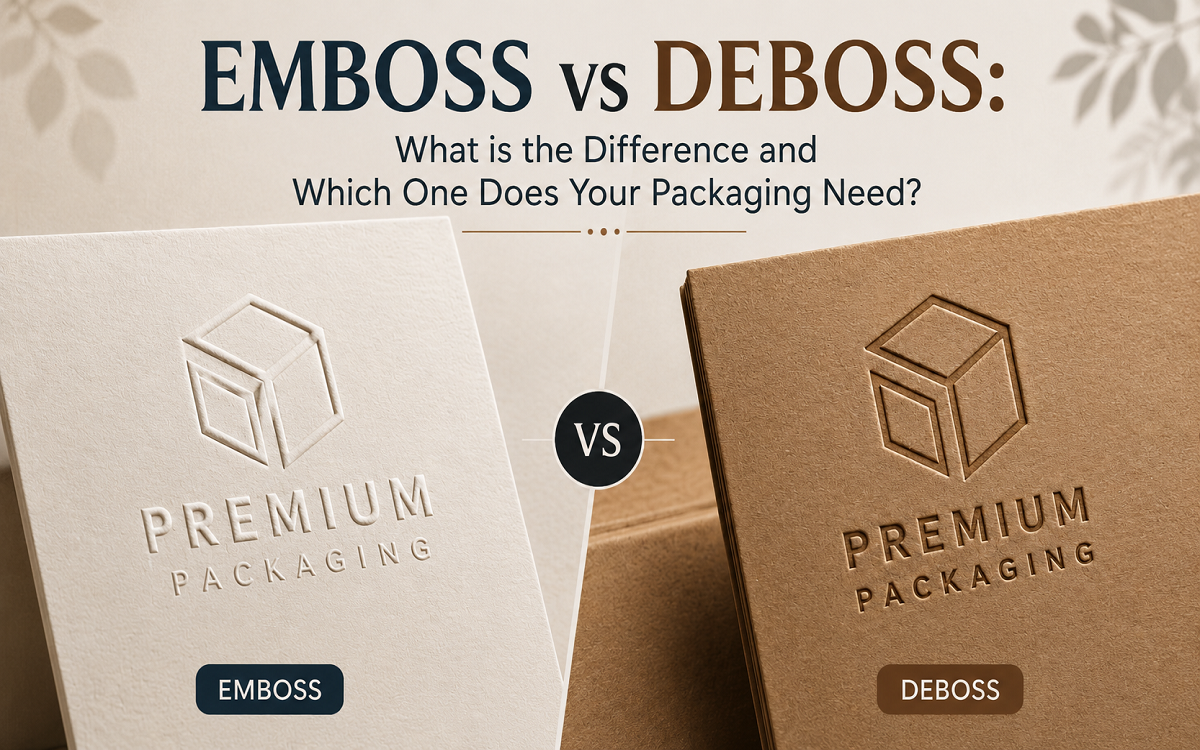
Embossing is a finishing process that raises a design above the surface of the material. A custom metal die and counter die press the board from beneath, pushing selected elements upward to create a three dimensional tactile relief.
The result is a design you can both see and feel. It catches light. It creates shadow at its edges. It draws a fingertip toward it naturally.
An embossed logo sits above the surface of the box, projecting outward with a confidence that flat print cannot replicate. Embossed book covers, embossed seals on certificates, embossed brand marks on rigid boxes all work on the same principle. The design comes out toward you.
Blind embossing takes this further by removing colour or foil entirely. The impression reads purely through texture and shadow. No ink. No metallic layer. Just the relief itself which on the right surface communicates more restraint and precision than any printed finish.
What is the embossing opposite?
Debossing. Where embossing raises a design above the surface debossing presses it inward.
What Is Debossing?
Debossing is the opposite of embossing. The die is pressed into the surface from above pushing the design inward to create a recessed impression.
A debossed logo sits below the surrounding surface. Its edges are defined by the compression of the material. Precise and considered. Where embossing projects toward the person holding the box debossing recedes into it. The effect is quieter. More architectural. It rewards close handling rather than demanding attention from a distance.
So if you have ever asked yourself is debossed in or out? The answer is in. Pressed down not raised up.
Debossed logos work particularly well on matte laminated surfaces and uncoated materials where the absence of gloss makes the surface relief the primary tactile and visual element. A debossed brand mark on a minimal rigid box communicates a kind of confidence that does not need to shout.
What is a debossed logo?
A logo pressed into the surface of the material. It sits below the surrounding surface defined by the compression of the material at its edges. Common on leather goods, premium packaging and minimal brand identities.
Emboss vs Deboss: The Core Difference
The difference between emboss and deboss comes down to one thing. Direction.
Embossing raises the design above the surface. Debossing presses it below. Both use metal dies applied under heat and pressure. Both work on paperboard, leather, fabric and other materials. The results are physically and visually opposite.
If embossing is the assertive option debossing is the restrained one. Neither is better. They communicate differently and the right choice depends on what the packaging needs to say.
What is the difference between emboss and deboss?
Embossing raises the design above the surface. Debossing presses it below. Both use metal dies under heat and pressure. The direction of the impression is the only fundamental difference.
Feature | Embossing | Debossing |
| ↕️ Direction | Raised above surface | Recessed below surface |
| 👁️ Visual effect | Projection and dimensionality | Depth and restraint |
| ✋ Tactile feel | Elevated and assertive | Indented and considered |
| 🎨 Aesthetic language | Bold and commanding | Minimalist and architectural |
| ✨ Foil compatibility | Yes — foil embossing common | Less common — typically blind |
| 💰 Cost | Slightly higher — two dies needed | More affordable — one die |
| 🛡️ Durability | Raised areas can wear over time | More durable — design is recessed |
| 📋Best use cases | Logos, brand names, gift packaging, statement pieces | Editorial, wellness, minimalist identities, subtle branding |
| 📦 Suitable packaging materials | Rigid boxes, folding cartons, thicker cardstock | Matte laminated boxes, uncoated stocks, leather like surfaces |
Embossing vs Debossing: Which Is Better for Premium Packaging?
Neither is categorically superior. The choice follows the brand’s visual language and where the packaging will be encountered.
Embossing is the right call when the brand needs to project. When the logo should reach toward the customer and catch light and signal premium positioning immediately. Foil embossing and registered embossing are near standard at prestige price points in fragrance, cosmetics and spirits packaging where the finishing tier directly reinforces what the product costs.
Debossing is the right call when the brand communicates through restraint. When quality is felt through precision and depth rather than decoration. It suits editorial, wellness and minimalist brand identities where a blind debossed mark on a matte surface says more than any foil finish would.
Many premium packaging programs use both on the same box. A debossed background texture or pattern combined with an embossed primary logo creates a layered tactile hierarchy that neither technique achieves alone. The contrast between recessed and raised adds depth and signals genuine manufacturing care.
Can embossing and debossing be used together on the same packaging?
Yes. Combining both on a single box creates layered tactile hierarchy. A common application is a debossed background texture paired with an embossed primary logo where the contrast between recessed and raised adds visual depth that neither technique achieves alone.
Additional Uses of Embossing in Packaging
Embossing does more work than most people give it credit for. Brands lean on it for logos, sure but also for brand names, patterns and decorative touches that make packaging feel like something rather than just look like something.
Raised patterns add texture to gift boxes, luxury packaging and special edition runs. Decorative embossing builds depth without a single extra printed element. You feel the design before you even read it.
Not Every Material Holds an Impression the Same Way
Embossing and debossing need thickness. Thin material cracks or flattens. A blurry impression is worse than no impression at all.
Rigid boxes are the reliable choice here. Thick construction. Deep impressions. No drama. This is why cosmetics, watches, jewellery and premium gift brands default to them.
Kraft boxes can take an emboss or deboss too as long as there is enough thickness behind the fibre. Kraft has a natural texture already so blind embossing tends to shine here. The design comes through in texture rather than colour which reads as intentional rather than decorative.
Thicker cardboard packaging handles both techniques well and shows up constantly in retail boxes, product packaging and folding cartons. It is the boring, dependable option and that is exactly the point.
Folding cartons for cosmetics, food and personal care items take embossing or debossing without adding real weight. A premium shelf look does not have to mean a heavier box.
Paper sleeves can carry an emboss or deboss too usually as an outer layer wrapped around a luxury box or gift set. Small surface. Big feel.
Stacking Finishes Changes the Whole Experience
One finish is nice. Two, done with restraint, can feel genuinely premium. The goal is never to pile on every effect available. It is balance between texture, shine and whatever the brand is actually trying to say.
Foil stamping paired with embossing gives you shine and depth in the same spot. Metallic foil catches the light. The raised design adds dimension. Together they land as bold luxury. This combination shows up often on high end logos and premium gift packaging.
Matte lamination next to debossing works because the recessed design becomes the whole visual. Nothing competes with it. Soft surface. Quiet depth. Clean result.
Spot UV against embossing creates contrast between glossy and raised areas and a brand can use that to point attention exactly where it wants it whether that is a logo, a pattern or a line of text.
Where This Usually Goes Wrong
Overly detailed artwork with thin lines or tiny text rarely embosses or debosses cleanly. Simple, well planned designs hold their shape. Complexity is the enemy here, not the friend.
Choosing material that is too thin is another common misstep. It cracks, flattens or just fails to hold the impression and no amount of pressure fixes that after the fact.
Ignoring brand style is a subtler mistake but a real one. A loud embossed logo does not belong on a brand built around minimalism. A quiet debossed mark might be exactly right there instead.
And then there is the temptation to add every effect available. More finishes do not mean more premium. Past a certain point they just mean cluttered.
Embossing or Debossing: The Short Answer
Want the logo to jump out immediately? Emboss it. Want something quieter, more minimal, more luxury adjacent? Deboss it. Want texture and depth in the same design? Combine both, carefully.
Embossing earns attention through height. Debossing earns it through restraint. Neither one is better. They just do different jobs.
Types of Embossing Used in Packaging
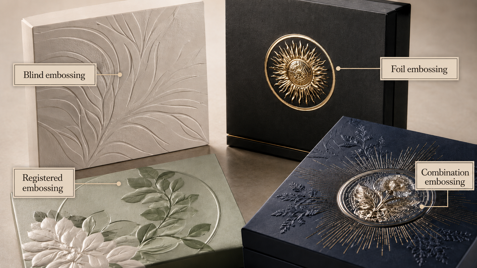
Not all embossing works the same way. Four techniques appear most often in premium packagin production.
Blind embossing:– No ink, foil or colour. The design reads entirely from the three dimensional impression and the highlights and shadows it creates. The most tactile and recyclability compatible option. Common in fine fragrance, prestige personal care and spirits packaging.
Foil embossing:– Combines hot foil stamping and embossing in a single press pass. A metallic or pigment foil is applied while the die simultaneously forms the raised relief. The foil conforms to the embossed surface and catches light from both the metallic layer and the dimensional geometry.
Registered embossing:– The die is aligned precisely to a specific printed or foiled element. Used when a logo or brand seal must be both printed and embossed with the relief reinforcing the exact visual position of the design.
Combination embossing:– A single die produces both foil transfer and embossed relief simultaneously. More precise than foil then emboss in sequence. The preferred specification for logos with fine type or detailed geometry.
Embossed vs Debossed Logo: What Each One Communicates
An embossed logo pops outward. It is prominent, tactile and immediately visible. It works beautifully on rigid boxes, premium retail packaging and anything where the brand mark needs to be the first thing a customer sees and feels.
A debossed logo is pressed inward. It adds depth and subtlety. The brand mark sits quietly into the surface defined by precision rather than projection. Common on leather goods, minimal cosmetic packaging and premium gift boxes where the design language leans toward restraint.
The embossing opposite is not just a directional difference. It is a tonal one. Embossing announces. Debossing implies.
What Materials Work Best for Embossing and Debossing?
Both techniques work on paperboard, leather, fabric, thick cardstock and certain plastics. For packaging specifically heavier board stocks produce the sharpest impressions.
Thicker board holds the relief without cracking at fold lines which is where lighter materials tend to fail under the combination of die pressure and fold geometry. This is especially important for rigid box packaging where the board weight is already significant.
Matte laminated surfaces suit debossing particularly well. The absence of surface gloss makes the recessed impression the primary visual element rather than competing with a reflective finish.
Uncoated and textured stocks work well for blind embossing where the tactile quality of the impression is the whole point and the surface texture adds to that effect rather than working against it.
Common Mistakes to Avoid
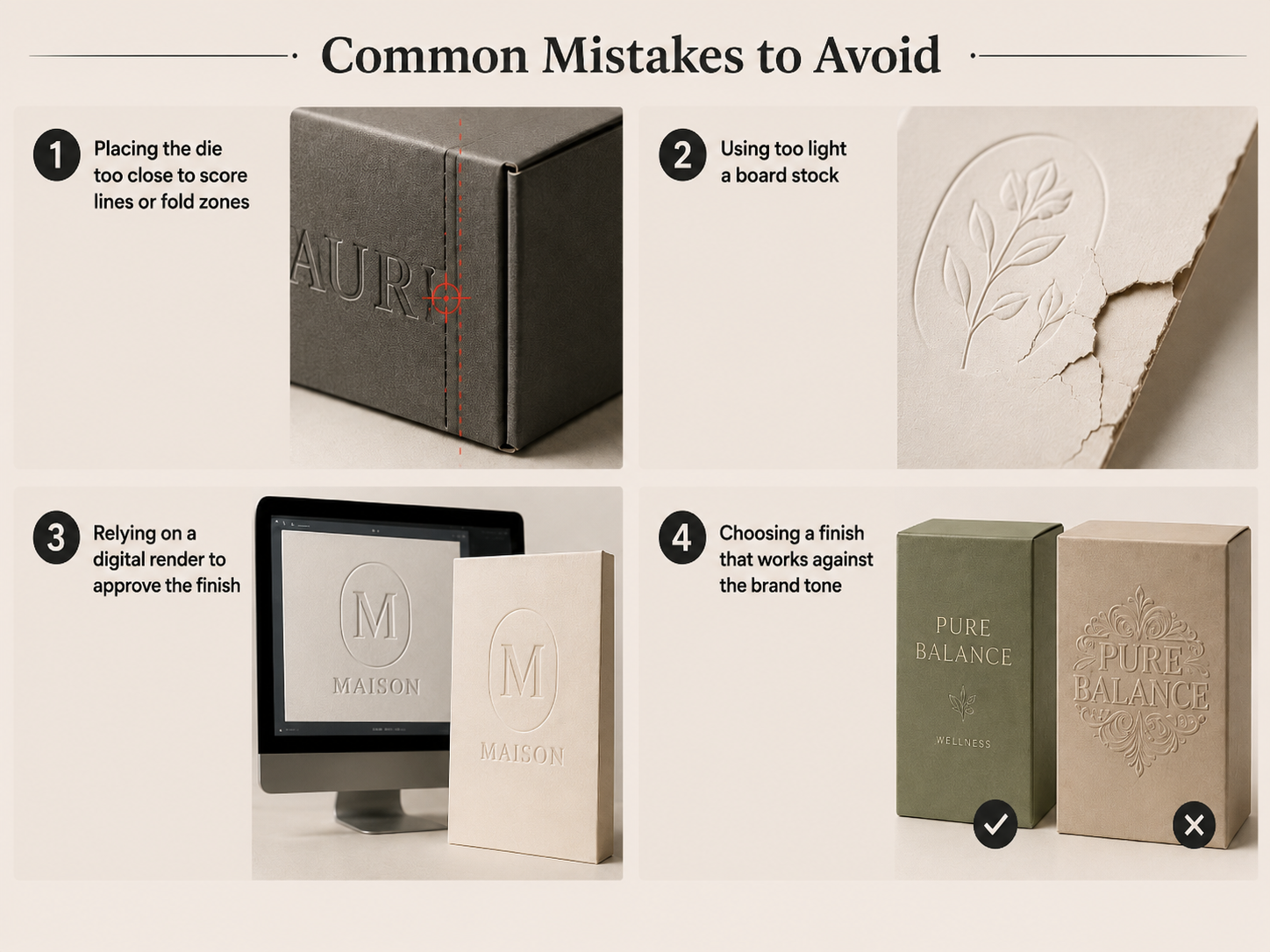
Placing the die too close to score lines or fold zones. Die pressure near a fold weakens the board’s ability to fold cleanly. The box can look correct as a flat blank and then crack or fail in use. Emboss zones should always be reviewed against the structural dieline before the die is made.
Using too light a board stock. Thin or flexible materials cannot hold a clean impression. The relief either flattens over time or causes cracking at the edges.
Relying on a digital render to approve the finish. Embossing and debossing need to be approved from a physical sample. The gap between what a screen shows and what the substrate and die actually produce is where most finishing mistakes originate.
A 3D packaging design tool like Pacdora can help review artwork placement and dieline positioning, although embossing and debossing should still be approved through a physical sample.
Choosing a finish that works against the brand tone. A bold embossed logo on minimal wellness packaging can undercut the aesthetic entirely. The finish has to follow the brand’s visual language not just be applied to it.
Embossing, Debossing and Sustainable Packaging
Blind embossing and blind debossing are the most sustainability compatible premium finishing options available.
Both are purely mechanical processes. No foil, ink, adhesive or barrier coating is added to the board. A blind embossed folding carton is fully recyclable through standard paper and board recycling streams. The impression does not degrade fibre quality or affect recyclability.
Foil embossing at low surface coverage is typically compatible with standard paper recycling. Full metallic coverage across a primary surface presents greater challenges and should be evaluated before specification if recyclability is a brand commitment.
For packaging teams with sustainability targets blind embossing on FSC certified board offers the same premium tactile signal as foil at a lower environmental cost and with a cleaner recyclability position.
FAQs
Is embossing more expensive than debossing?
Slightly. Embossing requires both a die and a counter die. Debossing typically uses a single die which reduces tooling cost modestly.
What does debossing look like?
Debossing creates a sunken design pressed into the surface of packaging. The logo, text or pattern sits below the surrounding material creating a subtle textured effect that can be seen and felt.
Why are credit cards not embossed anymore?
Many modern credit cards no longer use raised numbers because payment systems no longer require physical impressions. Flat printed or laser engraved designs are easier to produce, allow more design space and work better with modern card technology.
What packaging materials work best for embossing?
The best materials for embossing are thick and durable surfaces such as rigid boxes, heavy cardstock, cardboard packaging and folding cartons. These materials can hold the raised design without cracking or losing detail.
Is Debossing Engraving?
No. Debossing presses a design into the surface using pressure alone while engraving cuts or removes material to create a recessed effect. Engraving is typically used on metal, wood or glass and debossing is used on paper, board and leather. The two can look similar at a glance but the process and the material behind them are different.