PMS Colors: What They Are and How They Work in Packaging
Color accuracy helps a brand look consistent on every box. If a logo shifts between print runs, the packaging can feel unreliable. PMS stands for Pantone Matching System, a standardized color reference used by designers, brands, and printers. This guide explains PMS color codes, their role in custom packaging, and the difference between PMS and CMYK.
What Are PMS Colors?
PMS colors are standardized colors used in graphic design and printing. Each has a unique Pantone name or number, allowing brands, designers, and printers to refer to the same target color instead of relying on vague descriptions.
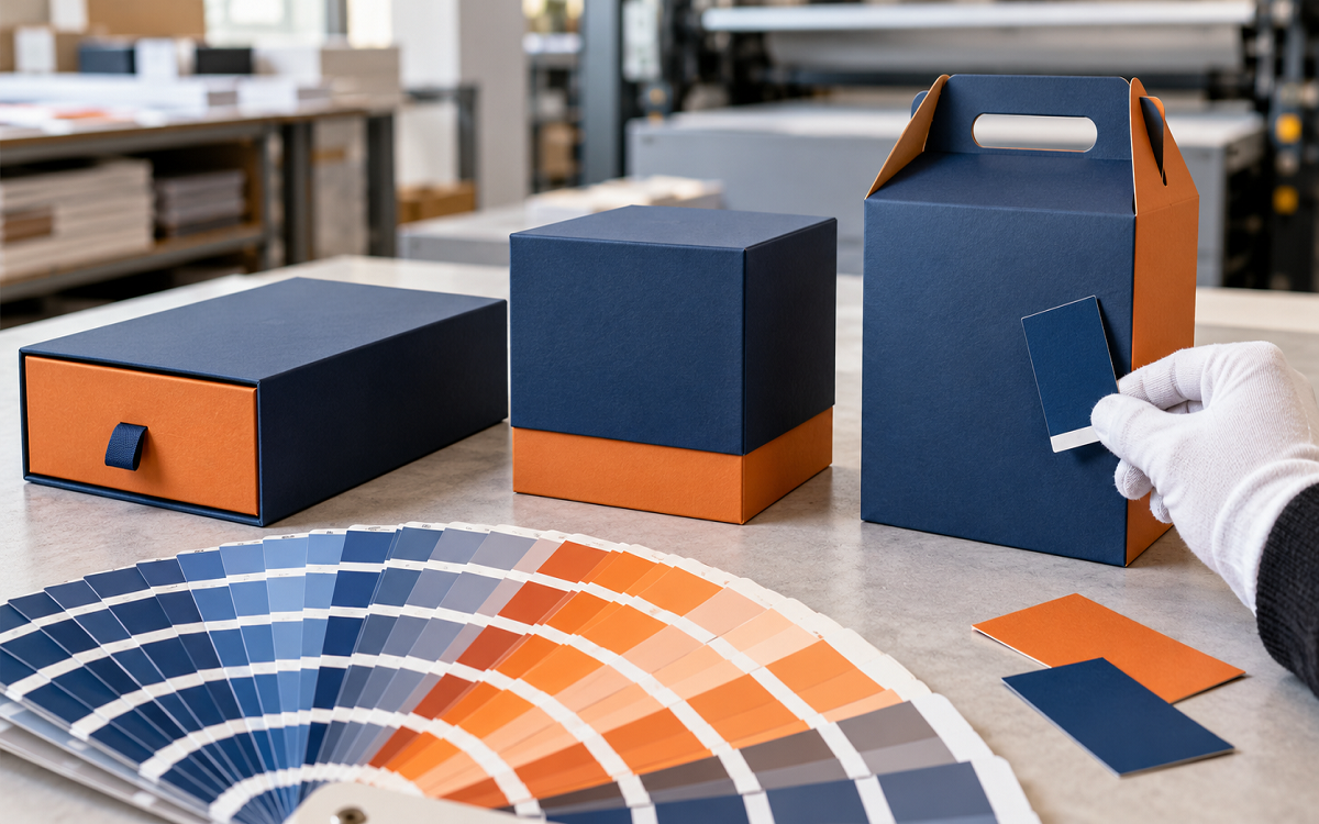
A designer selects a color from a physical Pantone guide and adds its code to the artwork. The printer prepares the corresponding ink and checks the result against that reference. PMS and Pantone are often used interchangeably because PMS is Pantone’s color-matching system.
How Does the Pantone Matching System Work?
The process starts with a printed reference rather than a screen. Choose a color from a current Pantone guide, add its exact code to the artwork, and have the printer produce a proof using the intended ink and material. Production begins after the proof is approved.
This workflow is more reliable than matching color by eye from a monitor. Screens use light, while packaging uses ink on a substrate. PMS creates a shared target, although material, finish, press conditions, and lighting can still affect the result.
Understanding PMS Color Codes: C vs U
In the Pantone Graphics System, many solid colors are shown with a C or U suffix. The letter identifies the paper stock used for the printed reference.
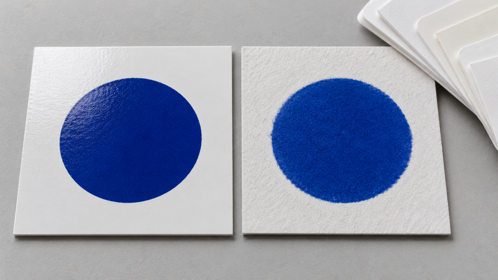
For example, PMS 186 C is shown on coated paper, while PMS 186 U is shown on uncoated paper. The ink formula may be the same, but coated stock limits absorption while uncoated stock absorbs more ink. The uncoated result therefore often appears softer or less saturated.
Match the reference to the packaging material: C for coated stock and U for uncoated stock. For kraft, colored board, or specialty finishes, request a production-quality proof because the paper base and coating can shift the result.
PMS vs CMYK: Which Is Better for Packaging?
PMS is better for exact brand colors. CMYK is better for photographs and detailed multicolor artwork.
| Factor | PMS | CMYK |
| Ink method | Pre-mixed spot ink | Four process inks |
| Best for | Logos and exact brand colors | Photos and complex artwork |
| Color consistency | More predictable | May vary slightly |
| Cost-effective when | Few precise colors are required | The design contains many colors |
| Special colors | Metallic and fluorescent options | Limited specialty-color range |
Many projects use both. A photo panel may run in CMYK while the logo prints in a single PMS ink.
Benefits of Using PMS Colors for Custom Packaging
PMS gives packaging a level of color control that process printing cannot always match.
- Colors stay consistent across separate packaging runs
- Logos reproduce more accurately
- Stronger brand recognition on shelf
- Access to vibrant and specialty inks
- Clearer communication between designers and printers
- Fewer color-related printing errors
- Better consistency across different packaging products
Using one PMS code across rigid and mailer boxes helps separate products look like one coordinated packaging line.
What Can Change the Appearance of a PMS Color?
Material and finish can change a PMS color’s appearance. PMS improves consistency, but it cannot remove every production variable.
Material. Coated board can keep color bright and crisp. Uncoated board may mute it, while kraft can shift the result because of its brown base.
Paperboard color. White board generally produces a more neutral result than colored board.
Finish. Matte lamination can soften a color, while gloss lamination may make it appear deeper. Varnishes add another variable, and embossing or debossing changes how light reaches the surface.
Printing method. Offset and digital presses may reproduce the same target color differently.
Lighting. A color approved under office lighting can look different under retail or daylight conditions.
White underbase. Dark or kraft materials may need a white ink layer beneath the color. Without it, lighter colors can appear dull or transparent.
How to Choose the Right PMS Color for Packaging
Choose a color from a physical reference and test it on the actual packaging material before committing to production.

- Use a physical Pantone guide instead of picking from a screen
- Select the correct coated or uncoated reference
- Request a proof on the actual packaging material
- Record the exact PMS code in your brand guidelines
- Review the proof under normal and retail lighting
- Ask the printer whether a white underbase is needed
- Compare PMS and CMYK results before converting a spot color
Final Thoughts
PMS colors protect brand consistency when exact color matters, but not every project needs them. The best choice depends on the artwork, material, print method, quantity, and budget. Photo-heavy designs may suit CMYK, while logos or signature colors may benefit from PMS. Art Impact Packaging can help you compare the options before production.
FAQs
What does PMS stand for in printing?
PMS stands for Pantone Matching System. It is a standardized color identification system used in design and printing so that brands, designers, and printers can refer to the same target color across projects and production runs.
Is PMS the same as Pantone?
PMS is Pantone’s color-matching system. In printing and packaging, PMS color and Pantone color are commonly used to describe colors identified through that system, especially solid or spot colors specified by a Pantone reference.
What is a PMS color code?
A PMS color code combines a unique Pantone color number or name with a suffix, such as PMS 186 C. In the Pantone Graphics System, C indicates a coated paper reference and U indicates an uncoated paper reference.
Are PMS colors better than CMYK?
PMS is usually better when a logo or brand color must be matched closely. CMYK is generally better for photographs and complex multicolor artwork. Some packaging uses both: CMYK for imagery and a PMS spot ink for a key brand color.
Can PMS colors look different on packaging materials?
Yes. Paper color, ink absorption, coatings, laminations, press conditions, and lighting can all affect appearance. A PMS code provides a common target, but a physical proof on the actual packaging material is the best way to approve the final result.
Can PMS colors be used in digital printing?
Digital presses can simulate many PMS colors using process inks or expanded-gamut systems, but the result may not be an exact spot-color match. Ask the printer about the equipment’s color capabilities and approve a physical proof before the full run.